import plotly.express as px
import plotly.graph_objects as go
import pandas as pd
import numpy as npLecture 6 - Plotly, and websites with Quarto
Overview
We cover:
- interactive plotting with Plotly
- using Quarto to turn Jupyter notebooks into HTML and other formats
- using Quarto to build websites
- hosting websites with GitHub Pages
References
This lecture adapts material from:
- P8105: Data Science I (Jeff Goldsmith, Biostatistics, Columbia University)
Plotly
Plotly provides a platform for online data analytics and visualization (built on HTML, CSS, D3.js).
Install plotly in your msds597 environment:
pip install plotlyPlotly Express
We’ll go through a few examples using Plotly Express, a high-level API for creating figures. Plotly Express lets us create figures in one line. Some of the figures available in Plotly Express are:
- Basics:
scatter, line, area, bar - 1D Distributions:
histogram, box, violin, strip, ecdf - 2D Distributions:
density_heatmap, density_contour - Matrix or Image Input (e.g. heatmap):
imshow - 3-Dimensional:
scatter_3d, line_3d - Multidimensional:
scatter_matrix, parallel_categories - Tile Maps:
scatter_map, line_map, choropleth_map - Outline Maps:
scatter_geo, line_geo, choropleth - Polar Charts:
scatter_polar, line_polar, bar_polar
Under the hood, Plotly Express uses Plotly graph objects and returns a plotly.graph_objects.Figure instance. (Think of Plotly Express as Seaborn, and Plotly Graph Objects as Matplotlib.)
Import packages
import os
os.getcwd()'/Users/gm845/Library/CloudStorage/Box-Box/teaching/2025/msds-597/website/lec-6'Data: NYC Uber Rides
We’ll look at Uber rides in NYC from September 2014.
This data is from FiveThirtyEight. Here is an example of a dashboard created using Plotly (and Dash, a Python framework for building web apps).
df = pd.read_csv('../data/uber-raw-data-sep14.csv')

df['Date/Time'] = pd.to_datetime(df['Date/Time'])
df['Date'] = df['Date/Time'].dt.day
df['Hour'] = df['Date/Time'].dt.hour
df['Weekday'] = df['Date/Time'].dt.day_name()df.head()| Date/Time | Lat | Lon | Base | Date | Hour | Weekday | |
|---|---|---|---|---|---|---|---|
| 0 | 2014-09-01 00:01:00 | 40.2201 | -74.0021 | B02512 | 1 | 0 | Monday |
| 1 | 2014-09-01 00:01:00 | 40.7500 | -74.0027 | B02512 | 1 | 0 | Monday |
| 2 | 2014-09-01 00:03:00 | 40.7559 | -73.9864 | B02512 | 1 | 0 | Monday |
| 3 | 2014-09-01 00:06:00 | 40.7450 | -73.9889 | B02512 | 1 | 0 | Monday |
| 4 | 2014-09-01 00:11:00 | 40.8145 | -73.9444 | B02512 | 1 | 0 | Monday |
Bar plots
We will first look at the distribution of rides over weekdays using px.bar.
weekly_rides = df.groupby('Weekday').size().reset_index(name='Count')
weekday_order = ['Monday', 'Tuesday', 'Wednesday', 'Thursday', 'Friday', 'Saturday', 'Sunday']
weekly_rides['Weekday'] = pd.Categorical(weekly_rides['Weekday'], categories=weekday_order)
fig_weekly = px.bar(weekly_rides,
x='Weekday',
y='Count',
title='Weekly Distribution of Uber Rides',
labels={'Count': 'Number of Rides', 'Weekday': 'Day of Week'})
fig_weekly.show()Note: by default, Plotly Express lays out legend items in the order in which values appear in the underlying data.
We can:
- sort values before plotting (
weekly_rides.sort_values('Weekday')) - or, add the argument
category_orders.
# adding category_orders argument
fig_weekly = px.bar(weekly_rides,
                    x='Weekday',
                    y='Count',
                    title='Weekly Distribution of Uber Rides',
                    labels={'Count': 'Number of Rides', 'Weekday': 'Day of Week'},
                    category_orders={'Weekday': weekday_order}
                    )

fig_weekly.show()
Line plots
Let’s look now at the number rides per hour, separated by day of week. We will make a line plot using px.line.
hourly_rides = df.groupby(['Hour', 'Weekday']).size().reset_index(name='Count')
hourly_rides['Weekday'] = pd.Categorical(hourly_rides['Weekday'], categories=weekday_order)
fig_time = px.line(
hourly_rides,
x='Hour',
y='Count',
color='Weekday',
title='Hourly Distribution of Uber Rides',
labels={'Count': 'Number of Rides', 'Hour': 'Hour of Day'},
category_orders={'Weekday': weekday_order}
)
fig_time.update_layout(width=700,height=500)
fig_time.show()Why does Tuesday have the bump? Remember, we are just counting all the rides over the month, per hour and per weekday…
df_day_date = df.groupby(['Weekday', 'Date']).count()
df_day_date = df_day_date.reset_index()
num_weekdays = pd.DataFrame(df_day_date['Weekday'].value_counts())
num_weekdays.columns = ['num_days']
hourly_normalized = hourly_rides.merge(num_weekdays, on='Weekday')
hourly_normalized['Count'] = hourly_normalized['Count'] / hourly_normalized['num_days']fig_time = px.line(
hourly_normalized,
x='Hour',
y='Count',
color='Weekday',
title='Normalized Hourly Distribution of Uber Rides',
labels={'Count': 'Number of Rides', 'Hour': 'Hour of Day'},
category_orders={'Weekday': weekday_order}
)
fig_time.update_layout(width=700,height=500)
fig_time.show()Facet plots
fig_time = px.line(
    hourly_rides,
    x='Hour',
    y='Count',
    facet_col='Weekday',
    facet_col_wrap=2,
    title='Hourly Distribution of Uber Rides',
    labels={'Count': 'Number of Rides', 'Hour': 'Hour of Day'},
    category_orders={'Weekday': weekday_order}
)

fig_time.update_layout(width=600,height=700,
                       margin=dict(l=20, r=20, t=60, b=20))
fig_time.update_xaxes({'showticklabels': True})

fig_time.show()
Histogram
Let’s now make a histogram of rides by hour on September 1, 2014.
keep = (df.Date == 1) # keep 1st day of month
sum(keep) # number of rides19961df1 = df[keep]colors = px.colors.sample_colorscale("viridis_r", [n/(24 -1) for n in range(24)])px.histogram(df1, x='Hour', color='Hour', color_discrete_sequence=colors)Plotly colors
Above, we defined the colors for the histogram using px.colors.sample_colorscale. This lets us create 24 colors from a continuous colorscale (here, viridis_r).
The available color scales can be found in px.colors.named_colorscales(). Note: if you add _r to a colorscale, it will be reversed.
You can also browse the available colors here:
Scatter plots
We now make a scatter plot by latitude and longitude, also for Sept 1, 2014.
fig = px.scatter(
    df1,
    x='Lon',
    y='Lat',
    title='Uber Pickup Locations in NYC on Sept 1, 2014',
    opacity=0.6,
    color='Hour'
)

fig.update_layout(
    xaxis_title='Longitude',
    yaxis_title='Latitude',
    autosize=False, height=500, width=600
)
We can also add marginal plots, similarly to Seaborn.
fig = px.scatter(
    df1,
    x='Lon',
    y='Lat',
    title='Uber Pickup Locations in NYC on Sept 1, 2014',
    opacity=0.6,
    color='Hour',
    marginal_x='histogram'
)

fig.update_layout(
    xaxis_title='Longitude',
    yaxis_title='Latitude',
    autosize=False, height=500, width=600
)
Scatter maps
Let’s turn this into a map!
fig = px.scatter_map(
    df1,
    lon='Lon',
    lat='Lat',
    title='Uber Pickup Locations in NYC on Sept 1, 2014',
    opacity=0.6,
    color='Hour',
    color_continuous_scale=px.colors.sequential.Viridis_r
)

fig.update_layout(
    autosize=False, height=500, width=600
)

fig
Let’s make an animation by hour! Unfortunately, px.scatter_map needs all values present in each frame for the legend to display properly, so let’s create some fake data first.
df_animate = df1.copy()
df_animate['Hour_plot'] = df_animate['Hour']
df_join = pd.DataFrame(columns=df_animate.columns)
hour, hour_plot = np.meshgrid(np.arange(0,24), np.arange(0,24))
df_join['Hour'] = hour.reshape(-1)
df_join['Hour_plot'] = hour_plot.reshape(-1)
df_join['Lat'] = 40.5 # outside range
df_join['Lon'] = -74.2 # outside range
df_animate = pd.concat([df_animate, df_join], axis=0)
/var/folders/f0/m7l23y8s7p3_0x04b3td9nyjr2hyc8/T/ipykernel_4979/1069851826.py:9: FutureWarning:
The behavior of DataFrame concatenation with empty or all-NA entries is deprecated. In a future version, this will no longer exclude empty or all-NA columns when determining the result dtypes. To retain the old behavior, exclude the relevant entries before the concat operation.
fig_animated = px.scatter_map(
    df_animate,
    lon='Lon',
    lat='Lat',
    color='Hour',
    opacity=0.6,
    animation_frame='Hour_plot',
    title='Hourly Pickup Patterns',
    color_continuous_scale=px.colors.sequential.Viridis_r,
    map_style='carto-positron'
)

fig.update_layout(
    autosize=False, height=800, width=800
)

fig_animated.layout.updatemenus[0].buttons[0].args[1]["frame"]["duration"] = 1000
fig_animated.show()
Quarto Introduction
Quarto is an open-source scientific and technical publishing system.
With Quarto, from your Jupyter notebook, you can easily publish reproducible articles/presentations/dashboards/websites/books in HTML, PDF, MS Word, and more.
Installation
You will need both the quarto software (from quarto website) and the VSCode quarto extension.
Download quarto here.
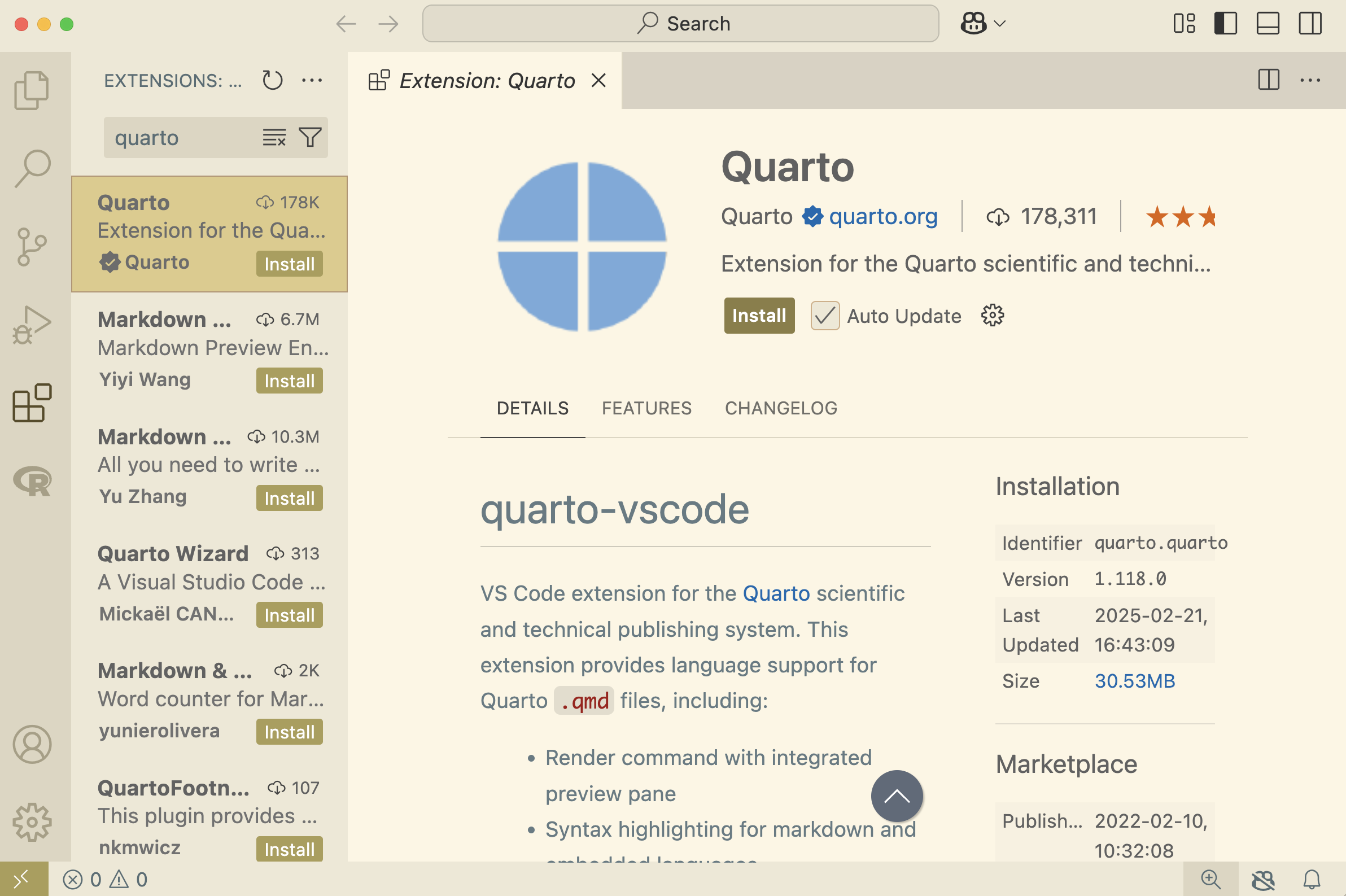
Install the VSCode Quarto extension from within the Extensions tab in VSCode:
- Click on Extensions Tab
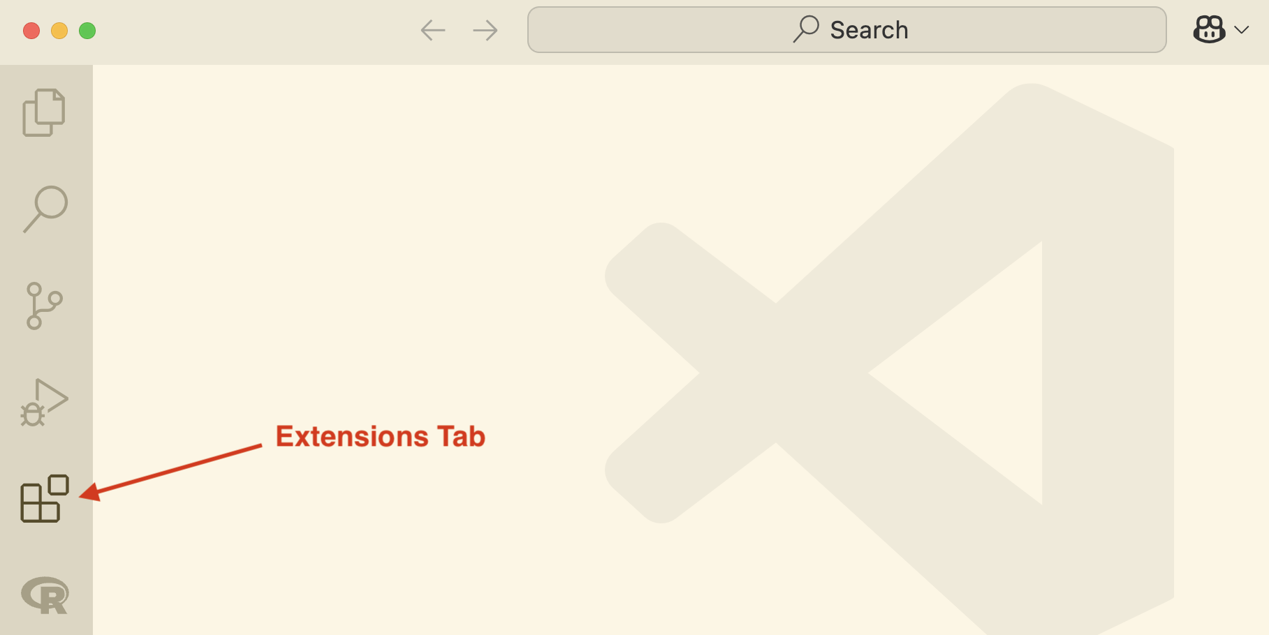
- Search for ‘quarto’, click on result and click install
Creating an HTML file from your Jupyter Notebook
YAML front matter
The first cell of your notebook should be a raw cell that contains the document title, author, and any other options you need to specify.
Note that you can switch the type of a cell to raw using the cell type menu at the bottom right of the cell.
Here is an example:
---
title: "My notebook"
format:
    html:
    code-fold: true
---
Here are some details on YAML options. You can add a table of contents, change the theme, and more.
Note: if you want to have a Plotly plot in your HTML file, you need to enable code cell execution in your YAML header. For example:
---
title: "Quarto Basics"
execute:
    enabled: true
format:
    html:
        code-fold: true
---
Markdown
A markdown language is a lightweight syntax that can easily be converted into HTML or another format.
In Jupyter notebooks, we have been combining markdown cells with python cells.
In markdown, we can include text formatting (e.g. bold or italics), as well as headings, images and hyperlinks. Some basics:
*italics*, **bold**, ***bold italics***

# Header 1
## Header 2
Image links:
Website links
[text-to-display](https://quarto.org)Here is a markdown guide.
Rendering and previewing documents
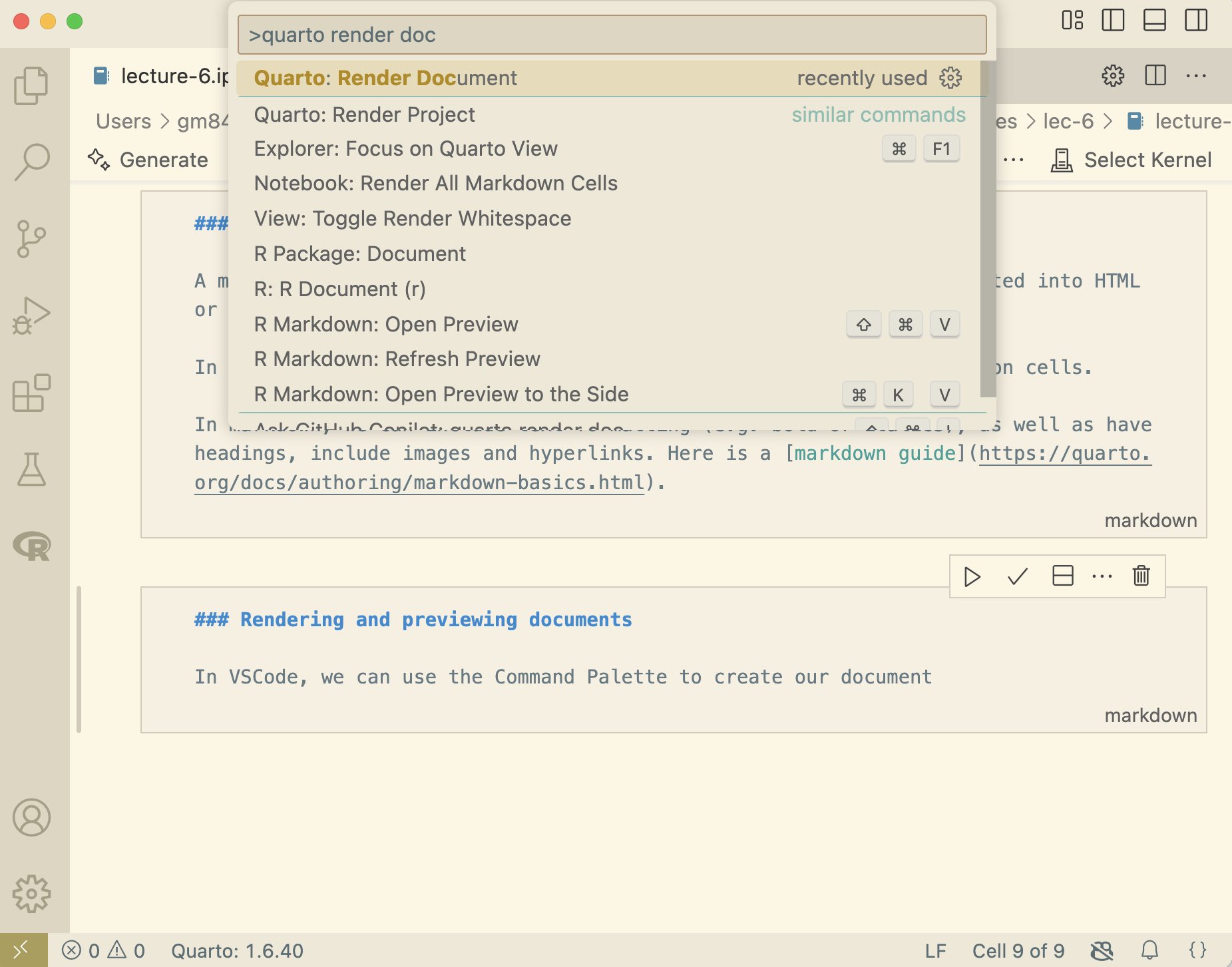
In VSCode, we can use the Command Palette to render our notebook into a document (e.g. HTML).
Open the command palette by selecting
View > Command Paletteor use the shortcut⌘ + ⇧ + p.
Type in
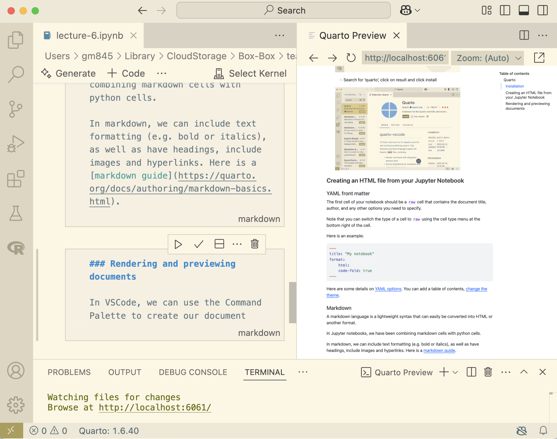
quarto render documentand select it. The rendered document will be saved in your working directory.To preview your document, in command palette, type
quarto preview:
Quarto .qmd files
Quarto can also render Jupyter notebooks represented as plain text (.qmd files). Here is an example .qmd file from the Quarto website.
---
title: "Quarto Basics"
format:
  html:
    code-fold: true
jupyter: python3
---

For a demonstration of a line plot on a polar axis, see @fig-polar.

```{python}
#| label: fig-polar
#| fig-cap: "A line plot on a polar axis"

import numpy as np
import matplotlib.pyplot as plt

r = np.arange(0, 2, 0.01)
theta = 2 * np.pi * r
fig, ax = plt.subplots(
  subplot_kw = {'projection': 'polar'}
)
ax.plot(theta, r)
ax.set_rticks([0.5, 1, 1.5, 2])
ax.grid(True)
plt.show()
```
The .qmd file contains:
- a YAML header
- markdown text (not in cells)
- python cells, created as:
```{python}
# insert code here
```
Websites with Quarto
A website is:
- a collection of related pages
- written in HTML
- hosted on a server and retrievable
Luckily, we don’t need to know too much HTML to make a nice website with Quarto! As we’ve seen, we can write a notebook and then convert it to HTML.
Example: Class Website
We can host websites using GitHub Pages.
GitHub Pages is a static site hosting service that takes HTML, CSS, and JavaScript files straight from a repository on GitHub and publishes a website.
Here is an example.
- I have put the first three lectures in this repo: https://github.com/moran-teaching/website
- Here is the resulting site: https://github.com/moran-teaching/website
Quarto Website Projects
All websites have an index.html file – it’s the most common name for the default page and gets served up whenever someone shows up at your site.
Quarto has a helpful project template for websites which sets everything up for you.
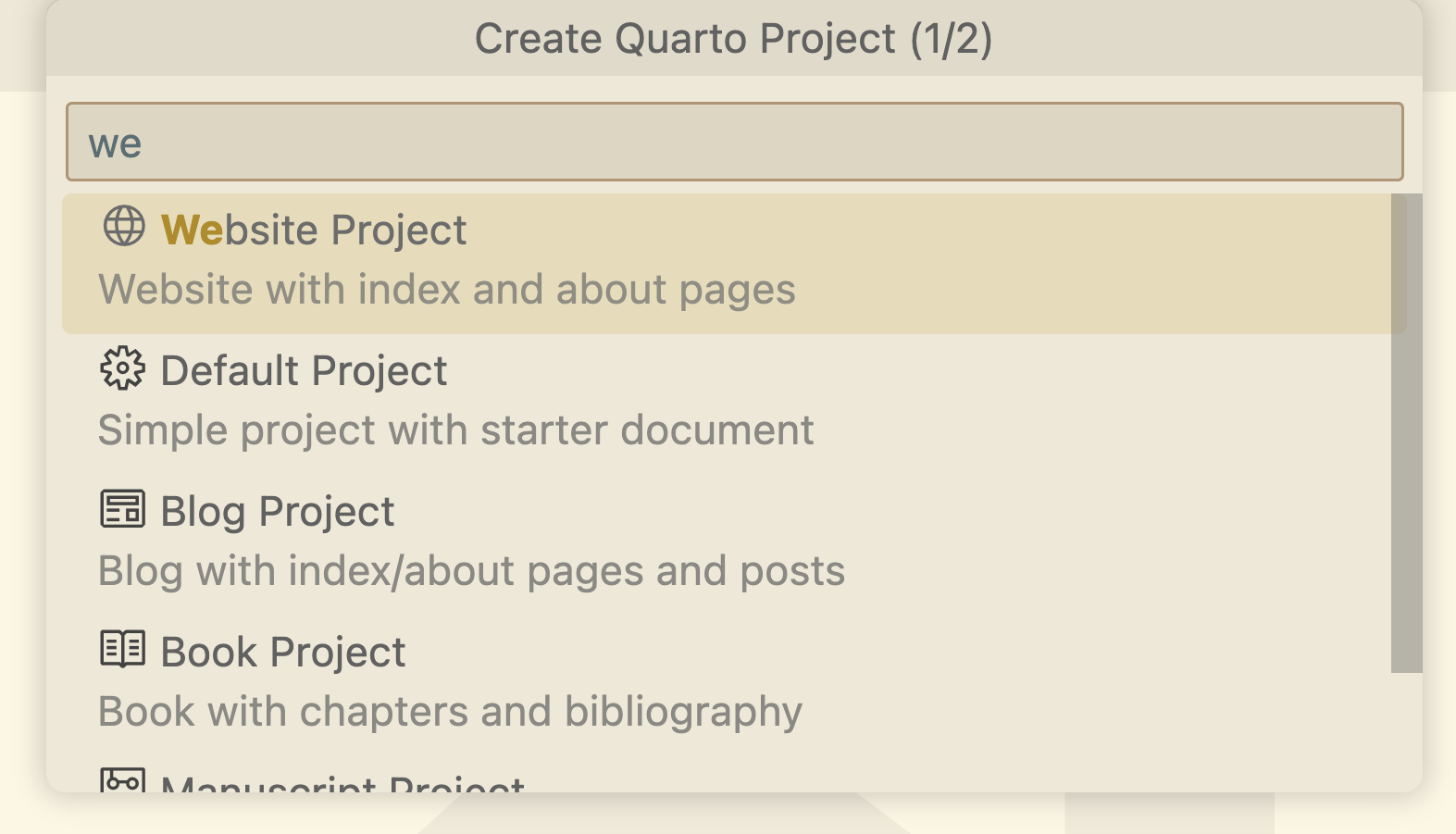
From the command palette, select “Quarto: Create Project”
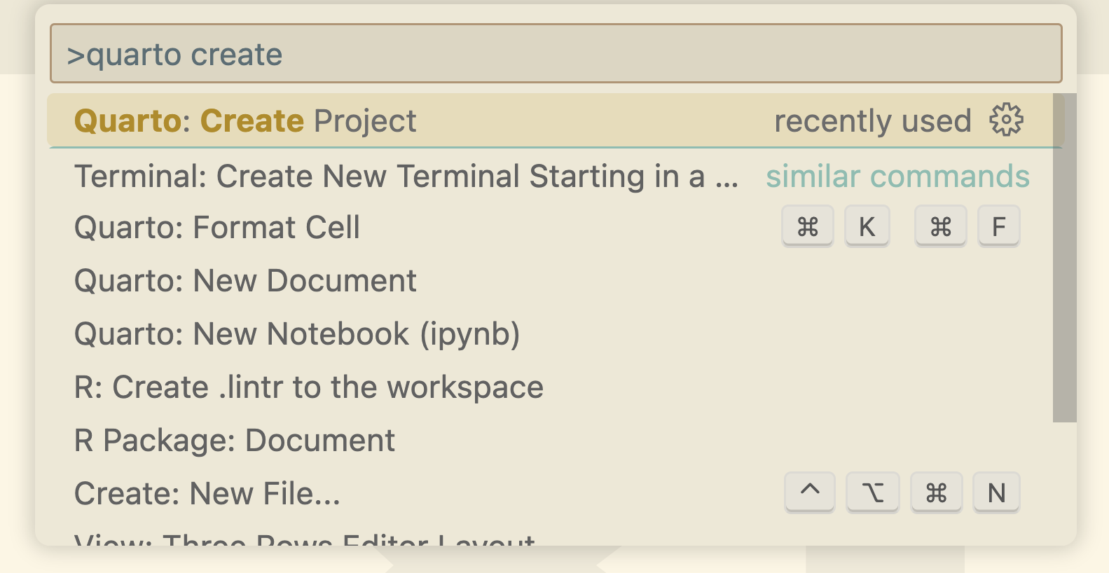
Choose “Website Project”
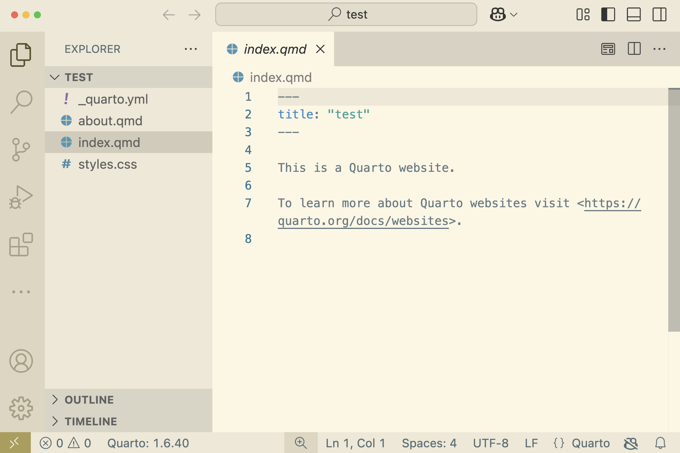
You now have a Website Project directory and files, including:
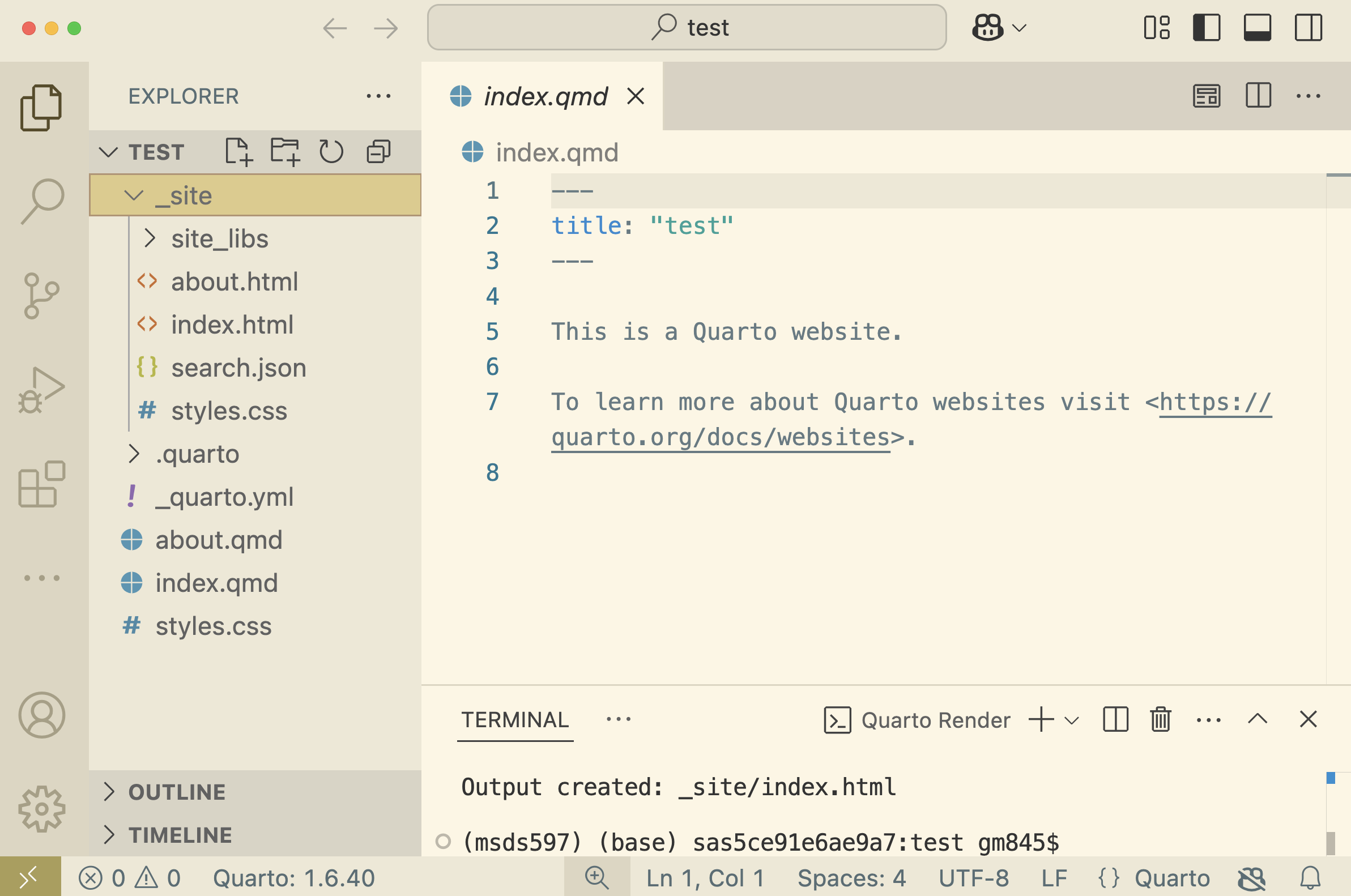
index.qmd: this will eventually be rendered asindex.html.about.qmd: another webpage-to-be_quarto.yml: we will discuss this in the next section
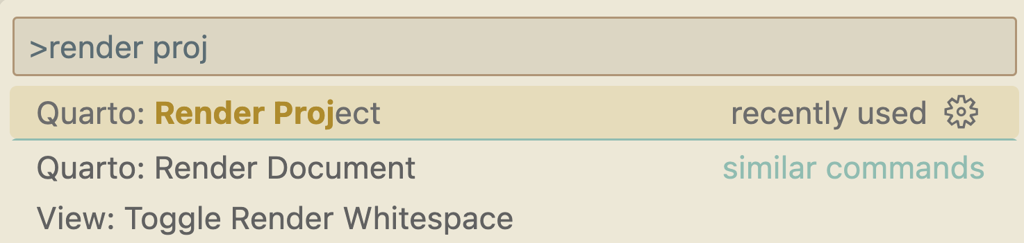
You can already render this project (via the command palette):
This creates a new folder
_sitewhich contains your website files, including:index.html: the landing page for your websiteabout.html: another webpage
NOTE: Web page names are case sensitive, and index.html has to start with a lower-case “i”.
- You can open your
_site/index.htmlfile in a browser and navigate around! (Note: this is just local on your computer, we haven’t put it online yet.)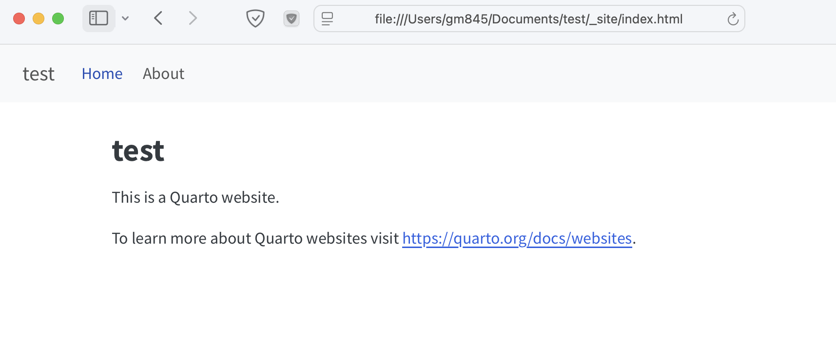
Configuring settings with _quarto.yml
The website configuration settings are in _quarto.yml. Every Quarto website has a _quarto.yml config file that provides website options as well as defaults for HTML documents created within the site. For example, here is the default config file for the simple site created above:
project:
  type: website

website:
  title: "test"
  navbar:
    left:
      - href: index.qmd
        text: Home
      - about.qmd

format:
  html:
    theme:
      - cosmo
      - brand
    css: styles.css
    toc: true
The website options has:
- the website title
- the navigation bar (
navbar), specified to be on the left, with links to the index page and the about page.This lets you navigate around the website.
The format options specify the theme and the CSS styles. It also has toc: True, which stands for table of contents - this means the markdown headers will be listed in a table of contents.
The Quarto documentation has more details about how to customize websites:
Exercise
create a Quarto website project, save it in a folder named
test-websiteadd a file named
plot.ipynbto yourtest-websitefolder with the following cells- a
rawcell with the YAML:
--- title: "Quarto Basics" format: html: code-fold: true ---- a markdown cell with the following text:
For a demonstration of a line plot on a polar axis, see @fig-polar.- a python cell with the following code:
#| label: fig-polar #| fig-cap: "A line plot on a polar axis" import numpy as np import matplotlib.pyplot as plt r = np.arange(0, 2, 0.01) theta = 2 * np.pi * r fig, ax = plt.subplots( subplot_kw = {'projection': 'polar'} ) ax.plot(theta, r) ax.set_rticks([0.5, 1, 1.5, 2]) ax.grid(True) plt.show()- a
in
_quarto.yml, changewebsitesettings to the following (inputing your github user name where appropriate):
website:
  title: "test"
  navbar:
    left:
      - href: index.qmd
        text: Home
      - about.qmd
      - href: plot.ipynb
        text: Example
    right:
      - icon: envelope
        href: mailto:<you@youremail.com>
      - icon: github
        href: http://github.com/<YOUR_GH_NAME>/
For more details about nav items, see here.
Hosting on GitHub Pages
We will host our new website on GitHub Pages, following these instructions. To host a website, you need to upload the website files to a GitHub repo. The first thing we will do is create another folder in test-website that has our website files - call it docs. (So its relative path is test-website/docs).
In _quarto.yml, add output-dir: docs under project e.g.
project:
  type: website
  output-dir: docs
Now, when we render the Quarto project, docs will also contain the files in _site.
Follow these steps:
- Accept this
website-exampleassignment on GitHub Classroom by clicking the following link (note: this is not graded). This will create a new repo calledmoran-teaching/website-example-<YOUR_GH_USERNAME>- this is where we will upload our website files.
https://classroom.github.com/a/58FxEOo8
- On your local computer, in Terminal (or other shell), navigate to your
test-websitefolder - We will turn
test-webisteit into a git repo (git_init), add thedocsfolder, add themoran-teachingGitHub repo as the remote, and push our files to the remote repo. These are the commands to do so:
git init
git add docs
git commit -m 'added website files'
git branch -M main
git remote add origin https://github.com/moran-teaching/website-example-<YOUR_GH_USERNAME>.git
git push -u origin main
Note: we use the argument -u in git push -u origin main the first time we push to the remote in order to set up tracking. For all subsequent pushes, we can use git push origin main.
- On GitHub, go to the repo
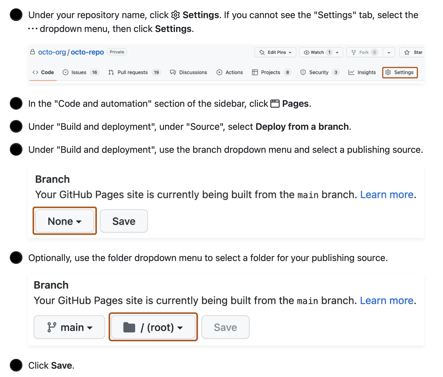
website-example-<YOUR_GH_USERNAME>. You should see all the files fromdocs. - Click on “Settings” and follow the instructions below, selecting
docsas the folder (instructions are from here).
- In your web browser, navigate to:
https://moran-teaching.github.io/website-example-YOUR_GH_USERNAME
Note: this is public to anyone with the link!!!
Personal website
In your personal GitHub account, you can also make a website (note: if you do not pay for GitHub, the repo needs to be public).
If your repo is named <YOUR_GH_NAME>.github.io, that’s your personal site address.
If your repo has another name, your site address will be <YOUR_GH_NAME>.github.io/<YOUR_REPO_NAME>. In this case, make sure to go to the repo settings and follow the steps above.